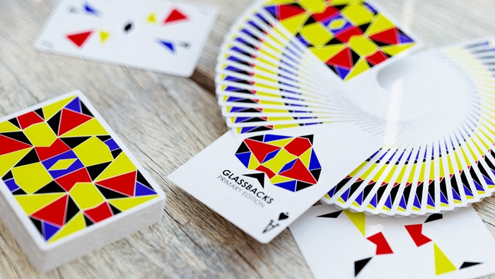
Glassbacks Playing Cards by Simon Bruna & Hyun Yoo
I know what you’re going to say, and you’d be absolutely right – I DON’T normally go for the ‘minimalist’ type designs of playing cards. But these ones struck me. Struck me good. The Glassbacks Playing Cards designed by Simon Bruno and artist Hyun Yoo are, well, just, different. Admittedly, the design elements of this deck are only on the backs, Jokers, Ace of Spades and the tuck box itself. All the pips are just ‘standard’, which (yes, I know you’re screaming at me right now) I’m always saying that I don’t like in current decks. But Glassbacks was very quickly forgiven because just look how striking that stained glass design is, and the bold primary colours just make it all pop.
No pretense
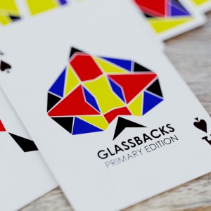
Glassbacks Ace of Spades
Could it perhaps also be that Simon is only in his late teens and that this is his first Kickstarter playing card project – his first playing card project full stop, actually…? I believe it just might be. You see, Simon isn’t arrogant – you can tell that from his Kickstarter introduction video – as a cardist himself, he just loves cards and knows what he likes, and how he likes them to look. He didn’t fall into the trap of feeling that he HAD to make the whole deck unique. The deck is what it is and it’s perfect as it is. There’s no pretense with this deck. I haven’t even seen any images of the actual pip cards but if they’re totally standard then so be it – I trust Simon and Hyun because they clearly know what they are doing. Particularly since this project has been successfully backed very recently on Kickstarter, and I am thrilled to say that I got in on the funding (big cheesy grin!)
For fans and flourishes
Primarily designed for the cardist in mind, this is an absolutely stunning deck. And as the Expert Playing Card Company will be making these cards, we know that the feel and handling will be superb too. In his own words Simon has said “The goal was to create a deck of cards that wasn’t too minimal but wasn’t too complex, yet was still bold and eye catching.” Well, you’ve achieved just that fella!!
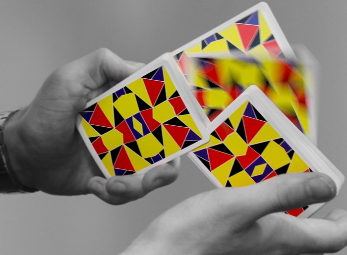
Glassbacks Cardistry
A neat little trick that Simon and Hyun incorporated into the design are the Jokers. It pleases me, as a Joker collector, that this was actually thought about. The two different Jokers are literally ‘lifted off’ the back design. So, basically, if you were to trace them and lay the tracings over the card back they’d fit perfectly – clever, eh?
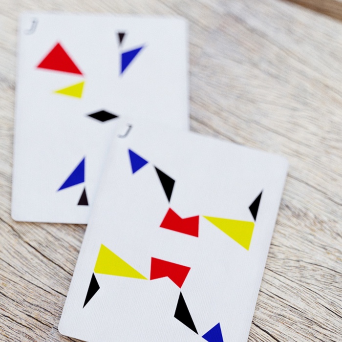
Glassbacks Jokers
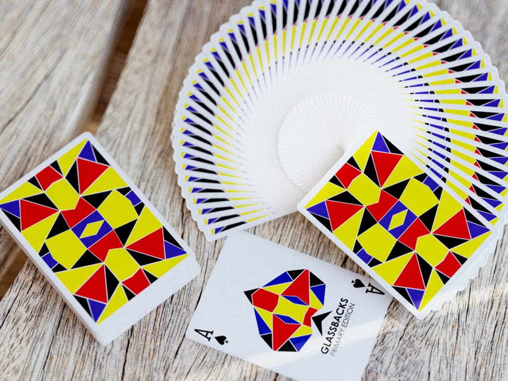
Glassbacks Playing Cards
So, this was just a little taster of the Glassbacks Deck. I will of course be writing up a full review once I’ve received my decks in my sticky paws. But I have no doubt that this is just the start of great things from Simon Bruno and Hyun Yoo – remember those names!
Do you have any thoughts or questions about this deck? Please feel free to leave any comments in the box below :)

Love the photos on this site, they are so clear. I want these cards now!
Hi Jo, aren’t they great? Like I said in my write up I don’t ‘usually’ go for this sort of thing, but these are pretty special :)
This deck really stands out, I love the bright colours and simplicity of design. I really hope they become widely available soon, thanks for the info.
These cards are beautiful – it just goes to show sometimes simpler is better!
Thanks Simon. Yes, I have to admit that my usual theory that ‘simple is boring’ has been debunked by this deck, and I’m very happy that it has. :)
Hey! I was just searching the web for cool cards to give as a gift and these look really amazing! I don’t see these in stores so I was wondering if you could get it online? Where would you suggest to look at? Thanks for sharing!
Hi Dustin. These cards were funded on Kickstarter just recently so they’re not on sale anywhere (yet). They now need to be printed, packed up and sent out to all those who backed the project. Then, usually, you will find them for sale on some playing card websites or on ebay etc. But that won’t be for a good few months yet. I appreciate your question, thanks. If I can help in any other way just let me know :)